Lethal touchscreens and other design disasters - and how to avoid them
By Mark Hurst • March 9, 2020
A recent Wall Street Journal article caught my eye: from Feb 21, You're Not Just Binge Watching Netflix. You're Having an 'Experience' describes how companies like Netflix and Mastercard are investing in the customer experience:
Customers don't just want to be the emotionless end point on a transaction. They want a good experience. More companies are viewing that experience as an increasingly powerful driver of business success.
Yes, this sounds familiar: A good customer experience is the driver of business success! I've been saying it for 23 years now, via Creative Good consulting. And yes, I still own goodexperience.com. (It points back to Creative Good.) So I appreciate the validation from the Wall Street Journal.
But the work isn't done. Companies today are still making the same! exact! mistakes! that they were making two decades ago: chasing fads, and investing in shiny tech, all while ignoring customer needs.
In fact, some mistakes are eerily similar to case studies I've written about in the past.
Decluttering stores
Here's one example. In my book Customers Included I describe Walmart's incredibly expensive decluttering initiative called Project Impact. In an attempt to attract Target shoppers in the early 2000s, Walmart redesigned dozens of stores nationwide to offer wider aisles and less cluttered inventory. From Customers Included, p. 57-58:
Walmart began rolling out redesigned stores in early 2009. Aisles were de-cluttered and products were displayed more attractively. Shelves were less tall, "end caps" (promotional displays at either end of an aisle) were removed, and inventory in "Action Alley," the main thoroughfare through the center of the store, was pruned enough to provide, in the words of one executive, "clear sight lines" throughout the store. . . .
Customers walking into redesigned stores immediately noticed the change. Not only were there clear aisles and less clutter, but by some estimates, 15% of the store inventory had vanished.
That reduction of inventory - the "decluttering" - drove more shoppers away from Walmart, and straight to Target. Adding up the cost of the redesign (and its reversal) and the lost sales in the decluttered stores, the error cost Walmart hundreds of millions of dollars. All because customers weren't included in the decision.
Walmart realized in hindsight that it was a mistake to remove so much inventory - sometimes very popular brands - from stores where customers go to see a wide selection of products. A modest investment in a customer experience project, before the rollout, would have revealed that decluttering the stores was the wrong strategy.
Fast forward to today. Mark Tritton is the new CEO of Bed Bath & Beyond, just three months into the job. He's promised to bring about a turnaround at the company, which has been under pressure for awhile (see this Oct 2018 WSJ article). Here's the WSJ on Feb 18, Bed Bath & Beyond Boss Tries to Declutter Stores:
Tritton plans to trim inventory by more than 10% this year, part of a broader plan that also calls for spending as much as $400 million on store remodels, technology upgrades and supply-chain improvements. Other changes include wider aisles and no more piles of merchandise up to the ceiling.
I wonder whether Tritton included customers in his decision to declutter the stores. Walmart failed to include customers before they launched their own initiative, and we see how that turned out. Tritton has already budgeted several hundred million dollars for the Bed Bath & Beyond project. If he hasn't yet applied the Creative Good approach to including customers in strategic decisions, now would be an excellent time.
Touchscreens
Second example. Back in 2010, Ford Motor Company launched MyFord Touch, one of the earliest touchscreens in consumer vehicles. Located in the center of the dashboard, the touchscreen had controls for A/C, heat, the radio, and so on - with a design twist: there were no physical buttons. The sleek, futuristic design was so cool, so "innovative," that drivers were forced to take their eyes off the road in order to access the controls. In an unusually negative review, Consumer Reports wrote that "we wouldn't recommend dealing with the frustrations of MyFord Touch even to an adversary."
The lesson is that sleek, futuristic touchscreens can be dangerous - especially when they replace basic, reliable physical controls.
The U.S. Navy might have saved lives by learning from Ford's mistake. As ProPublica reported last December, the Navy destroyer USS John S. McCain collided with another ship in the Singapore Strait, killing ten sailors in the process. Below, an image from the touchscreen user manual (with labels added by ProPublica):

Source: ProPublica
As ProPublica points out: "The control screen was supposed to make it easier to navigate a ship. But many sailors found the system's arrows and buttons confusing."
In other words, the Navy's sleek, futuristic touchscreen turned out to be dangerous - especially as it replaced basic, reliable physical controls. Just like MyFord Touch.
Learning from mistakes - or not
You might ask whether Ford has learned from its mistake and embraced a "customers included" method, spending some time with customers to understand their needs before sprinting off to a high-tech solution.
Unfortunately, Ford appears to be continuing its faulty design practices. In Can Design Thinking Save Business? (Jan 31) the Wall Street Journal covers the use of "design thinking," the trendy design method embraced by tech-friendly executives, including the CEO of Ford:
There are plenty of design-thinking case studies that are still being written. Topping the list is a complex and costly effort by Ford CEO Jim Hackett to use these relatively new principles to force a 116-year-old automobile company to act more like Tesla Inc. or even Mr. Jobs's Apple.
I'd advise Ford's CEO to steer away from design thinking, because that's what caused the MyFord Touch disaster. From Customers Included, p. 70:
Why did Ford remove something that drivers wanted, and replace it with a product that threatened their safety? Some clues are available in a conference presentation given by two members of the MyFord Touch design team shortly after the system launched. The presenters describe their innovation process, which involved weeks of brainstorming in seclusion - "we literally camped out and nobody saw us for many months" - followed by the rapid construction of a prototype, after which customers were brought in to go through "predefined tasks."
The result was a sleek, futuristic design that art-school designers might appreciate aesthetically, but that ignored the needs of the people who would actually use the system.
MyFord Touch was created by design thinking: the designers brainstormed for several weeks with no customers present, after which they ran a few Agile-style rapid iterative user tests on their prototype. Given that the underlying concept was created without any customers included, it's no wonder that the touchscreen failed.
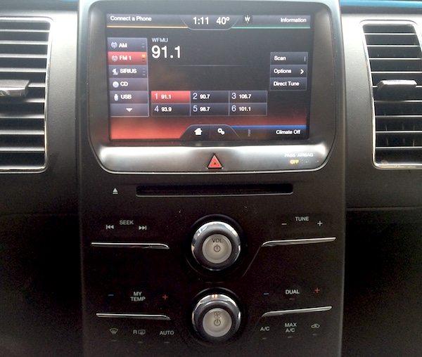
MyFord Touch. The chrome lines below Seek, Tune, etc. are purely decorative, not buttons.
A final twist. In my recent column Juul and the corruption of design thinking, I described how the co-founder of Juul, the widely reviled e-cigarette company, credited Stanford's d.school with his "design thinking" approach. Stanford's d.school was created by IDEO, the company that pioneered "design thinking." And IDEO was the agency hired by Ford to create . . . MyFord Touch.
If the CEO of Ford, Bed Bath & Beyond, or any other company, wants to avoid a high-profile failure, I'd recommend that they read Customers Included. And then drop Creative Good a line.
- - -
SHARE THIS:
To share this post, retweet this, or copy and paste this:
Lethal touchscreens and other design disasters - and how to avoid them, by @markhurst:
https://creativegood.com/blog/20/lethal-touchscreens-and-other-design-disasters.html
- - -